Hexbreaker
Hexbreaker: Button Sprite Swaps
Hello, this is Arissa and in this devlog post I'll be going over how to create the various sprite versions of a button asset when using the sprite swap mode in Unity.
When using Unity buttons there is a transition mode in the Button component that will allow you to use different sprite assets for different states. These states are Highlighted, Pressed, Selected, and Disabled. Each field has to have an asset linked to it for it to work. Unlike the Color Tint mode, this means we'll have to create these assets ourselves since it won't tint automatically.

Base Design
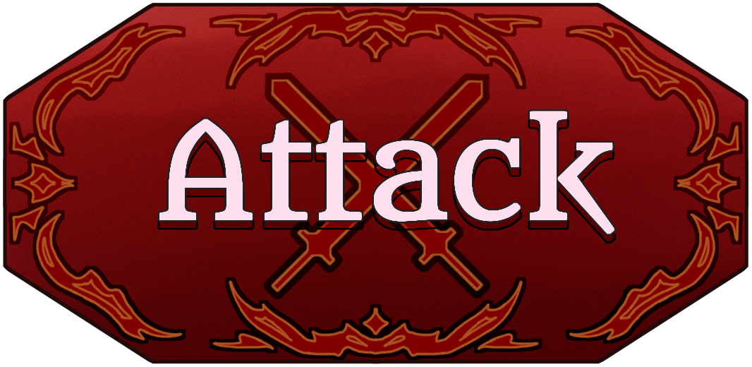
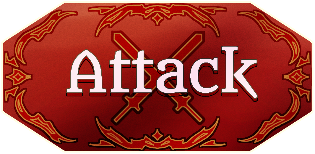
First, let's design our button. It should be able to roughly fit inside or around a square/rectangle shape so that the visual asset doesn't stray too far from the edges of the button hitbox. Depending on the type of button, there may or may not be embedded text in the design. Buttons that are general use and have various different uses will have a background only, allowing easy changes to text within the engine. Others, such as specialized combat buttons, will have rendered text in their asset and won't use in-engine text features.
It should have visual aspects to convey what kind of button it is to the player as well stay in line with the style of the game. To use our attack button as an example, I chose to use a red base color to represent the the attack function and added flame designs to the edges to tie in with Rosalin's design and how she attacks.
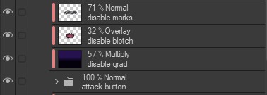
Disabled
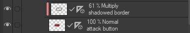
Now that we have a base design we can work on adding different variations to it for the different states. Let's start with disable. Since the player can't interact with this button it should be darkened quite a bit. In the desired program, have a multiply layer clipped above the entirety of the button and fill with a purple or blue color and set to multiply. Adjust the opacity as needed, though it should be dark enough to show that it's not active. To make it more interesting, dark texture can be added to give variation.

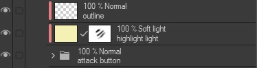
Highlighted
For a highlighted version, create a bright and light colored outline around the shape (maybe a little bit on it if there's a dark border). On another layer use screen or soft light mode to add an overall lighter tone with a light yellow or other color that would fit with the tone. Shine can be added as well to give that extra glow depending on the type of material that is intended.
Pressed
Lastly, the pressed version. Like the previous one, it should have the lighter tone but not as bright as when it's highlighted. Next, emove the bright outline and add a soft shadow to the edge of the icon, blur it slightly if needed (or hard shadow depending on the visual style). The lightness is to give the sense that this is the button the player is attempting to press but different enough to separate it from the highlighted version, which the shadow around the edge helps with by giving a pressed inwards look. Removal of the bright border also separates out the asset from the highlighted version and lets the player know they are pressing the button.
This ends the guide on creating assets for different button states! Hopefully this helps in giving perspective on what to think about when using this transition mode in Unity. It allows for a massive amount of creativity in what a disabled, highlighted, or pressed button would look like in different games.
- Arissa
Leave a comment
Log in with itch.io to leave a comment.